Vsparks is a simple static HTML template so it's simple to customization.
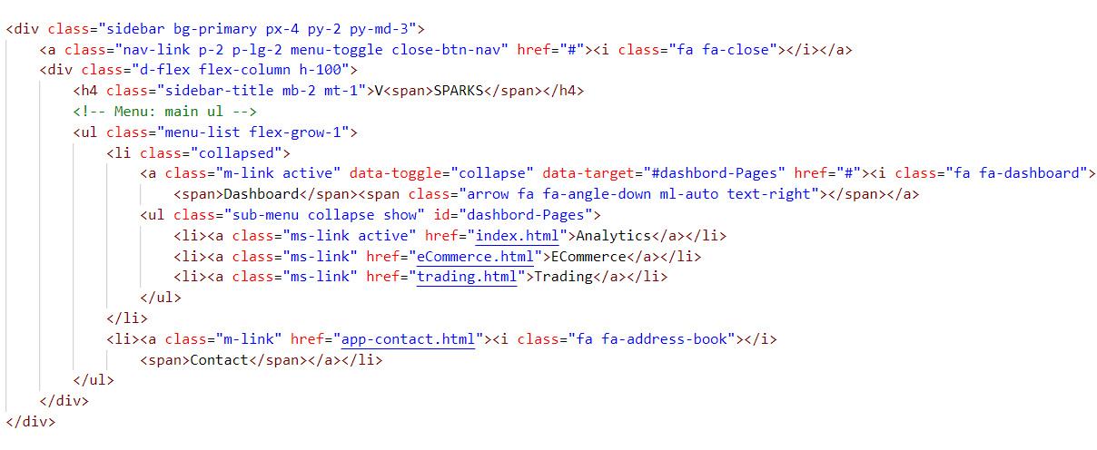
There are three type of Dashboard Option.
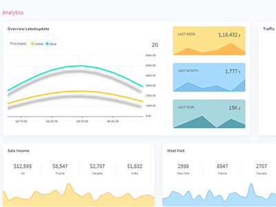
- Analytics
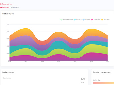
- ECommerce
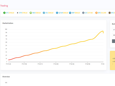
- Trading
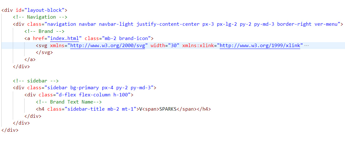
There are two type of logo's available in Vspark.one is Svg Logo and second is Text Logo
- change svg logo in navigation menu
- change text logo in sidebar menu
just simply change anchor tag font icon.menu create using flex and menu toggle for using collapse.
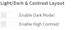
Just select Contrast layout in setting option
Light/Dark & Contrast Layout
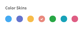
Just select Color Skins layout in setting option.there are multiple color combinations option available
Color Skins
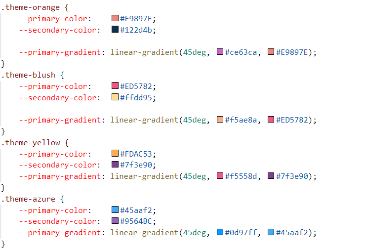
Just change body tag class For EX. theme-orange ,theme-yellow etc..

Customize color combinations theme here Primery color & Secondary color File:themes.scss
Note: Theme Color Class put in to body tag.